
Saturday, 5 March 2016

Thursday, 3 March 2016
Wednesday, 2 March 2016
Editing Process; Adding a trail
Adding a Trail:
 There was one shot we really liked which was a low angle shot, which we had to lie on the floor to film. This one shot we really liked as not only did it feature our character but also the busy London background all around it. We got Megan to run away from the camera, as this shot followed on from the one which Megan looks behind her shoulder in fear at something coming up behind her. As she is running quite fast, we wanted the shot to last longer so that the audience can take it the surroundings of London but also see that Megan is running away from something. The shot was really quick so we firstly has to slow it down by 25% so it was a bit longer. We then went onto the the edits section of on Final Cut Pro and played around with a few features which could make this running shot look a bit more interesting. One effect we both really liked and thought looked interesting was the effect called 'Trails'. This effect makes the movement of the shot slow down and almost shadow the movements which are made in the shot, in this case it was Megan running. So each time Megan moved slightly there was almost a shadow of her previous movement behind her. We felt like this effect emphasised this running shot more and make it more interesting.
Friday, 26 February 2016
Editing Process; Colour Masking
Adding a colour mask:
For this one shot we wanted the colour of focus to be red, whilst all the other colours in the shot were drained and more dull. We did this buy creating a colour mask, a colour mask isolates a particular colour on an image. On the selected clip, we went onto the colour collection bar in the effects section. Then we selected the Apply masks section. This then makes the colour mask parameter appears in the same section as the video inspector. As the mask parameter appears we then enlarged it and dragged it to fit the entire section of the post box as that was the iconic piece of set we wanted our audience to focus on. As we changed the size of the parameter the rest of the image becomes monochrome/ a more drained. We used a lot of mask parameters to make sure that the entire section of the post box was filled to create our desired effect. We then played around with the different shadows, mid-tones and exposure levels that we could use on our monochrome section of the shot until we found a colour shot which had a bit of colour, so it wasn't black and white.

Overlaying Shots:
We had two shots which we really liked of Megan walking towards the post box and posting a mysterious item. We really wanted a way to incorporate these two shots into our trailer without it becoming too repetitive, doing a shot overlay was a really good way to do this. To create this overlay we cut both of our shots and dragged one on top of the other. We then played around with the opacity and the burning techniques on final cut pro which gave us different ideas of how the two shots could be incorporated together through using different colours etc. Both of the shots had the colour masking technique so they blended really well together and created an effective and different technique.

Wednesday, 3 February 2016
Editing Process
Editing of our trailer:
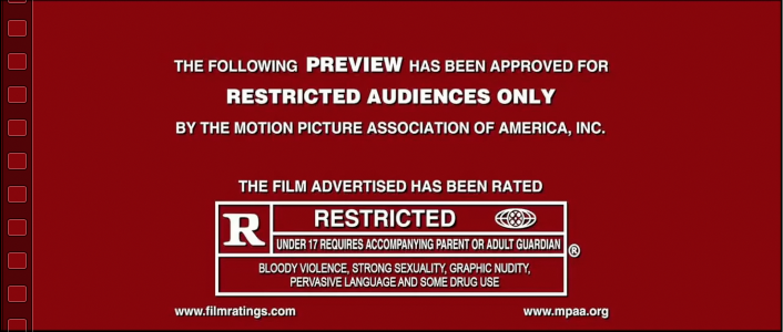 The first part of our editing process of our trailer was too insert a 'Restricted audience' warning. We thought this was necessary as when when analysing other trailers we noticed that they almost always had the film rating at the beginning or end of their trailer. This is something that has to feature at the beginning of every film trailer, as if you are a parent with a small child, about to watch a trailer, it informs you right away that you should not encourage your children to watch the film/trailer to this film as it involves content that it not suitable for everyone.
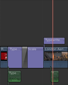 In our film trailer, we knew it was vital that we used an establishing shot of London, as in most action films they use a birds eye view of the location they are filming in. We needed an establishing shot of London, but obviously this was not practical and impossible for us to do. Therefore we used a found shot of London. We then cut out the parts of this shot using the blade tool on Final Cut Pro, so only the more profound landmarks of London were seen. We did this as it meant we would target a larger audience due to the amount of tourist's these landmarks attract. The next thing we did was added in subtitles at the bottom left hand corner of the shot, adding the date and location of the shot, this makes the audience aware of the time period and where the film is set. We thought that adding these subtitles fitted in quite well with the genre as it is quite a common feature in action films, as often action films are filmed and set in various different locations worldwide. Obviously we didn't have the ability to be able to film in loads of different countries, but the subtitles set the idea of filming in loads of locations. Once we had cut our shots we added a type writer sound for a professional effect.
We wanted our characters to be introduced in our trailer, we started of with a long shot of Megan walking towards the camera. We think this shot is effective as in the background it looks really busy on the roads, yet the character is on her own walking, meaning that she looks really isolated and endangered on her own.


Wednesday, 13 January 2016
Task 13 Ancillary Products, FILM POSTERS
Ancillary Products: Film Posters

We really like this magazine poster for James Bond in Empire. One thing we really like about this film magazine cover is the way it is completely focussed on the main character of the film. The photo is in black and white which looks really effective and the contrast between the facial features and the rest of his face with a shadow effect makes the character look mysterious.
The way the gun is quite subtle and not a main focus of the poster, but is just subtly shown in the corner of the poster is much more effective than just having the gun in a really obvious and noticeable position on the poster. The focused shot really emphases the characters facial expression making him look professional and dangerous.
We liked the way the film poster only uses toned down colours such as whites and gold, we feel as if this goes with the action genre of the film and makes the overall appearance look very professional. The film again poster has quite small text on the 'Bond is Back!', this is good as it would make a passer by of the magazine have to take a closer look at the cover drawing interest into the film.

Another film poster we really liked was this James Bond Skyfall cover. Once again the picture of the main character is in black and white, this seems quite a common theme for action genres to have them in black and white. This is something we may take inspiration from as we really think it makes the covers look more serious and quite classy, which is what most action genre films present, a classy but dangerous life style. We quite liked the way the characters head overlaps the Empire logo as it shows that the main focus of the magazine cover is the movie as the character over powers the title. The white background is also quite bold, and contrasts with the black suit and dark shadows surrounding James Bond's body. The gun once again features in this film cover as this is iconography of the action genre. The gun, the pose and the black suit and tie costume all tie in together to create a really upper class and desirable look. The colour theme black, white and gold follows in this film poster as well, which is also a repeated theme which the James Bond films must follow. Once again the title of the film is also very small and in a subtle place.
The way the gun is quite subtle and not a main focus of the poster, but is just subtly shown in the corner of the poster is much more effective than just having the gun in a really obvious and noticeable position on the poster. The focused shot really emphases the characters facial expression making him look professional and dangerous.
We liked the way the film poster only uses toned down colours such as whites and gold, we feel as if this goes with the action genre of the film and makes the overall appearance look very professional. The film again poster has quite small text on the 'Bond is Back!', this is good as it would make a passer by of the magazine have to take a closer look at the cover drawing interest into the film.

Another film poster we really liked was this James Bond Skyfall cover. Once again the picture of the main character is in black and white, this seems quite a common theme for action genres to have them in black and white. This is something we may take inspiration from as we really think it makes the covers look more serious and quite classy, which is what most action genre films present, a classy but dangerous life style. We quite liked the way the characters head overlaps the Empire logo as it shows that the main focus of the magazine cover is the movie as the character over powers the title. The white background is also quite bold, and contrasts with the black suit and dark shadows surrounding James Bond's body. The gun once again features in this film cover as this is iconography of the action genre. The gun, the pose and the black suit and tie costume all tie in together to create a really upper class and desirable look. The colour theme black, white and gold follows in this film poster as well, which is also a repeated theme which the James Bond films must follow. Once again the title of the film is also very small and in a subtle place.
Subscribe to:
Posts (Atom)